It has been a warm start to the school year in two ways. One the temperatures here are very hot and the warmth and kindness I have received this past week has been heart warming. One week into school and I had a terrible kidney stone attack that resulted in my first ambulance ride to the emergency room. My students who attended to me were incredible at getting me help quickly. Only a few short days later, Back to School Night was here and I was embraced in even more warmth for my healthy recovery from the parents of my students. I have to say it was a nice feeling after a pretty painful experience.

Photo Booth getting finished for Watermelon Festival
This is the first school year that I am teaching advanced level studio art classes and it feels very different from my usual routine of teaching Foundations of Art. I was able to skip some of the formalities due to the fact that most of my students know me, know the studio, and they were more than ready to create something. And that is exactly was we did, on the first day. I wanted to get into the deep end and swim about with only a few guiding ideas. This serves as a warm-up for my students and an assessment for me. Most students haven’t drawn or painted all summer so they needed to shake off the rust. I wanted to see if some new students offered up a few surprises for me and it allowed me to do a general assessment on how the group may function together in the studio.


I am teaching Drawing I, Painting I and II, Printmaking, and AP Studio Art. I have created a very flexible studio space with most of my furniture on wheels and smaller tables that I can quickly move about to accommodate the course materials. I love teaching the basics for the Foundations class but I am learning I also really like having advanced classes too.
Drawing started with a simple lesson on a long piece of paper and I asked them to draw images related to what they did this summer. Criteria: Imagery is based on what you did, ate, saw, and experienced. Ink drawing using a quill and ink well. Utilizing a range of values using dots, lines, scribbling, cross-hatching, etc. I also wanted the students to merge the imagery in a compositional layout that demonstrates the understanding of a foreground, middle, and background. Once the student accomplished that problem, I wanted them to create a positive/negative space; viewing window for an interactive experience for the display. The artist had to select a motif that supported the concept that they already created in ink. All of this allowed me to see how they handle directions and compositional layout. Plus other terms and techniques I feel students should already have a fairly good grasp of for this class.
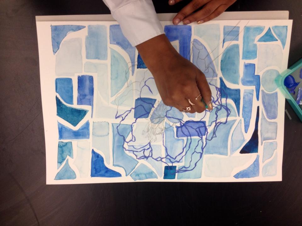

Next on the list is Painting I and II- Both of these classes are of a moderate size so it will allows me to work with individuals as the work evolves and push the artists to express a clearer personal voice in the works of art this semester. Painting I began with a simple concept of a grid layout with a limited color palette of two colors. We reviewed color schemes, watercolor mixing, and tints and shades. I wanted the students to demonstrate their comfort level with watercolors and color mixing. We discussed the qualities of watercolor paper and watercolor pigments. Next I wanted to assess the student’s ability to draw from direct observation by looking at a silk flower of their choice. Students then redrew the modified contour line drawing on the grid watercolor painting. I gave them options of compositional layout with asymmetrical or symmetrical balance. I feel the results not only helped me review important basics with the students but I was able to gauge where I needed to reteach, introduce, and review. The final outcome of the lesson turned out a beautiful painting that the artists were very proud to display.

Painting II began with a panel board and acrylic paint. I gave the students a selection of colors, tape, brushes, sponges, and other tools to manipulate the paint. I wanted them to show texture, value, movement, and fill the picture plane. Next the students looked at all the panels and discussed what they saw and how it was created. Some students over painted and kept layering while other students saw a motif emerge. I assigned that they create a silhouette to interplay with the color field. I did not limit the student to any level of details. I wanted to see where the artists would go, see their methods of exploration and questioning, and how they resolved the solution. After the student felt they completed the project we discussed why they made the decisions they made.
This fits perfectly in line with teaching ARTISTIC BEHAVIORS. It also fits in with my idea of an artist studio. My method of teaching art is very focused on the students experience and development. I want them to be excited to try and explore all the possibilities. I want them to have time for self-discovery and time to discuss their thoughts and ideas too.


Stencil Monotype
Printmaking is very close to my heart because you can be a great printmaker without being a great drawing student or a great painting student. It’s an equalizer for all due to the possibilities inherit in the process.
Mono prints are how I start. Reductive, Additive, Stencil, Trace, and Chine-colle. This is the order I explore at the beginning to get the students comfortable with all the tools, soaking of the paper, mixing of the inks, application of inks, and how to use the press. I have been so busy with a studio full of students. Everyone is beginning to get the hang of things and the room is full of all variations of the above processes to create original works.


AP Studio Art began with reviewing the summer assignments and watching the students present the artist research PowerPoint’s of a selected artist related to their own body of work. I asked the students to pull out the worst summer drawing and to crop a section to divide the picture plane to see divisions of the space. We then began the process of a tempera resist. I like this process to break down the tension of the expectation of the course and to complete a Breadth piece, right away. Breaking the “ice” and working with loose unpredictable outcomes will open up the students to the possibilities. As the semester progresses the AP artists will run into artist blocks so this is also a great method to use at anytime to “work” through the artist block.

Our current “big idea” is the Golden Ratio, Golden Mean, etc. The scale, media, and motif are in the student’s hands. I present a PowerPoint and a Pinterest board on the concept but most of my students already know a lot about this concept through their history class or math classes. We have a few risk takers who are exploring non-traditional materials so I am already impressed and excited with the progress.


I hope you are having a great start to your school year. I am feeling very blessed to be healthy and happy to be celebrating my 25th year of doing what I love everyday.

Watermelon Festival- Face Painting Booth

Wildcat Photo Booth

Face Painting- Watermelon Festival


Recent Comments